In the financial services world, trust and clarity are everything—especially for young professionals just getting started with long-term planning. For this comprehensive student project, I took on the role of UX/UI designer to help FutureFunds, a fictional financial planning platform, refresh their website after receiving negative feedback about confusing navigation and information overload.
My mission? Redesign the experience to feel approachable, easy to use, and aligned with UX best practices. This project was fully executed in Adobe XD, from user flow mapping to high-fidelity wireframes and a usability testing plan—providing a polished, end-to-end presentation ready for development.
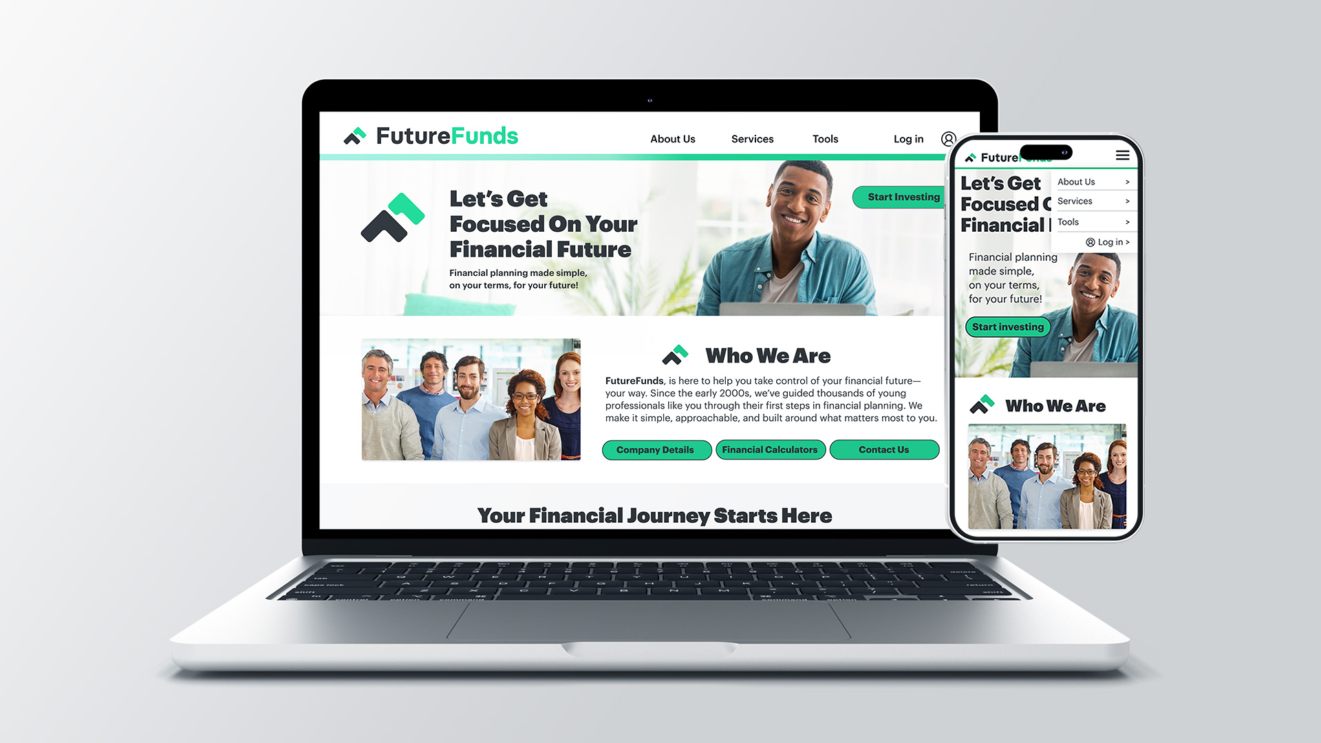
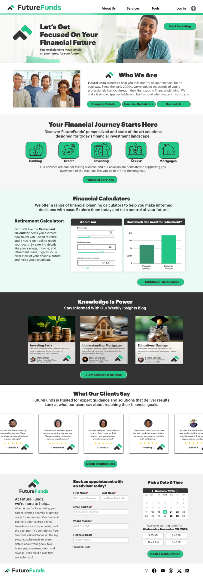
Web interface High Fidelity Wireframe
The desktop layout offers a clean, welcoming home page with a strong value proposition and clear calls-to-action.
Key features include:
Hero section with friendly imagery and a direct CTA (“Start Today”)
Modular sections for services, calculators, blog posts, and testimonials
Interactive retirement calculator with real-time feedback
Accessible appointment booking form with calendar and time selector
Visual hierarchy, mobile-responsiveness, and WCAG accessibility guidelines guided the structure and styling.
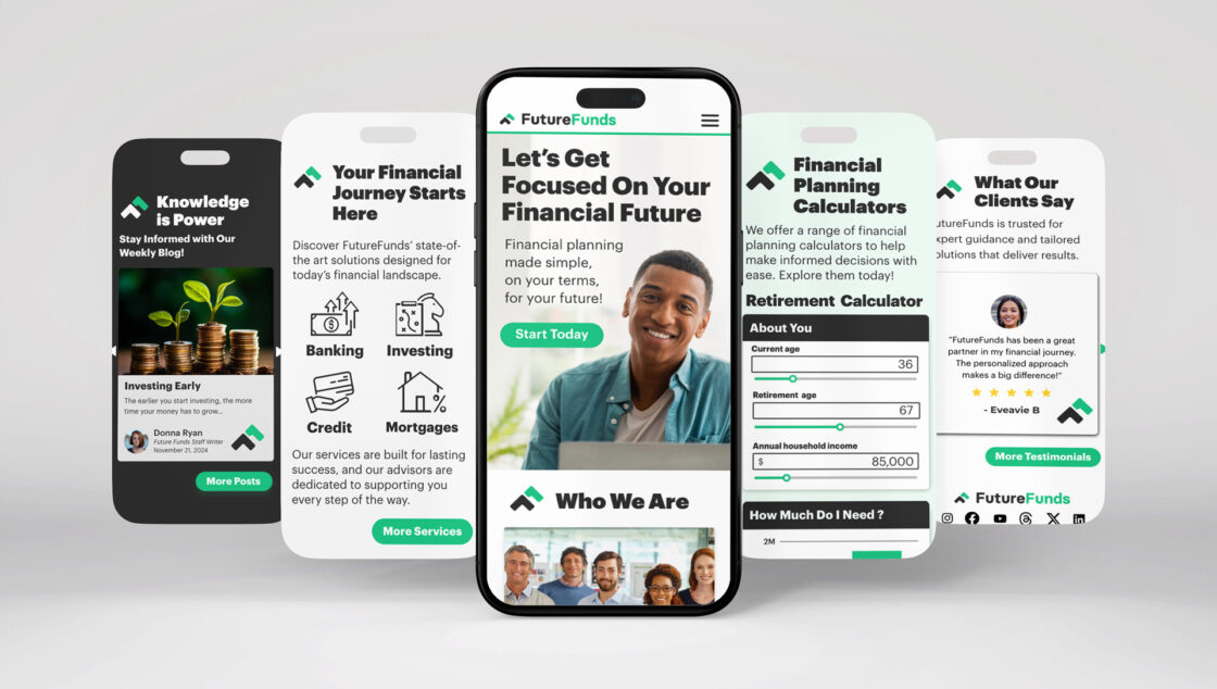
Mobile interface High Fidelity Wireframe
The mobile wireframe is designed for intuitive, thumb-friendly navigation and fast load times. It preserves core features of the desktop version, with adjustments to layout and flow for smaller screens.
Key features include:
Vertical stacked layout for easy scrolling
Tappable CTAs and slider-based input for calculators
Optimized form fields for booking an appointment
Emphasis on clarity, tap targets, and minimal cognitive load
CHALLENGES & APPROACH
The biggest challenge was transforming a cluttered, overwhelming experience into something that felt simple, welcoming, and intuitive.
Working entirely in Adobe XD, I applied core UX principles to improve navigation, visual hierarchy, and accessibility. From there, I created desktop and mobile wireframes, built to meet WCAG accessibility standards and real-world device constraints. I also designed a usability testing plan to validate the flow before handoff.
Navigating through vast amounts of information poses a significant challenge, requiring efficient information management strategies. Implementing tools such as digital libraries and knowledge management systems can help streamline access and organization of data. Emphasizing user training and adopting agile methodologies can further enhance information management practices, ensuring effective utilization of available resources.
THE RESULT
The final Adobe XD presentation delivered a clear, user-centered vision for FutureFunds, helping users explore services, engage with tools, and book appointments with ease. This comprehensive project showcased my ability to take a design from concept to execution, backed by best practices in UX, UI, and mobile-first thinking.